design for events, print and web

email us on hello@curiousdesign.ie

curious logo

Design A to Z - Printing

One of the highlights of our job is getting a new job back from the printers - it’s very exciting to see your work come to life!

If you are unfamiliar with the print industry however, it can be tricky to know which type of printer and print technique to use. With this in mind, we have put together this simple guide to explain some of the more common printing techniques.
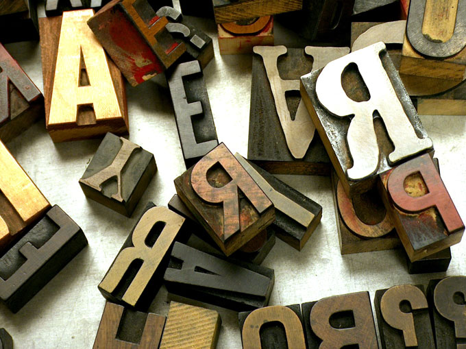
Wooden type - these letters can be used in letterpress printing

Letterpress
Letterpress is the original commercial printing technique.

Letterpress is a relief printing technique, this means that a raised surface has ink applied to it which is then pressed into a sheet of paper. The raised surface could be wood or metal type, an engraved plate or even a woodcut.

Johannes Gutenberg’s famous printing presses, which sparked the Printing Revolution in Europe in the 15th century used the letterpress technique, and letterpress remained the main printing process up until the 20th century.

While it is very labour intensive, Letterpress has enjoyed a revival recently and is often used for wedding invitations and business cards. The impression made by pressing the text and images into the paper is now often exaggerated for extra impact.

Offset Lithography
This is the most common printing process today and is sometimes referred to as Litho printing or Offset for short.

Offset lithography uses different printing plates for different colours. A black and white design would only need one plate while a colour photograph needs four - Cyan, Magenta, Yellow and Black - which combine together to create all the colours in the image. Special colours and inks can also be used. These are called spot colours and require an extra plate.

The cost of creating these plates means that this process is usually not suited to small jobs (or runs) but it is usually the most cost effective method if a large quantity of prints is required.

Digital Printing
Digital print presses are essentially very big and very fast colour laser printers.

Digital printing does not offer the same quality, flexibility and colour control as Offset printing. However, a high quality digital printer will still produce good results and as there are no plates to prepare turnaround times are shorter and set up costs lower. This makes digital printing a good choice for small print runs.

Other printing processes include screenprinting, thermography, engraving, gravure, foiling and more.

Not sure which print process is right for your job or want to use one of the processes we’ve mentioned but not sure where to start? Get in touch - we’d love to help!
Design A to Z - Opacity

This is not a term restricted to the ladies out there, opacity in this instance is not related to how see-through your tights are!

It refers instead to the density of a color. The opacity of an image or graphic element can range from totally transparent or see-through (0% opacity) to fully opaque or not see-through (100% opacity). Transparency is the measure of how see-through something is or how much light can pass through an object or image.

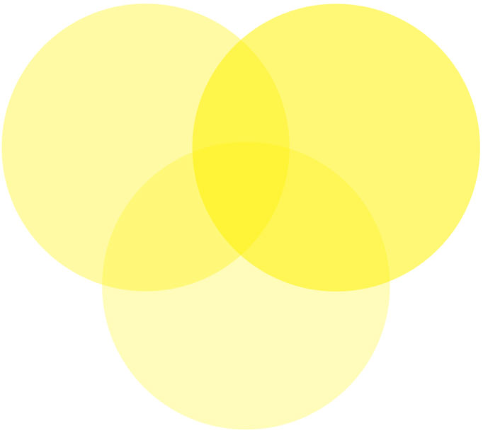
These overlapping circles are all yellow but have different levels of opacity applied to them, one is 30%, one is 40% and one is 60%. As they lose opacity they become transparent.

Opacity and transparency offer designers an excellent way of creating depth and texture in their design work. Designers utilise these tools in logo design, to create watermarks on stationery and many other ways, the possibilities are endless! Below is an example of a photograph with text and a graphic element placed on top of the photograph with 50% opacity applied.

Opacity was once limited to print design but recently it has moved into web design. Lots of exciting effects can be created using opacity and transparency in web design.

If you think that opacity would suit a print or web project you have in mind, let us know, we would love to explore the possibilities with you!

Style Serendipity

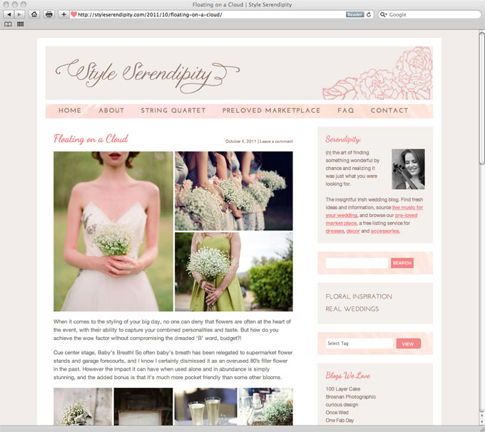
Congratulations on launching this morning to Ciara from Style Serendipity, a new Irish wedding blog and classifieds site.

As two ladies with weddings on the brain, this was a dream project for us and we really enjoyed working with Ciara on the design and development of the site.

style serendipity

In the lead-up to your big day and looking for some inspiration? Have some bits and pieces from your own wedding you’d like to pass on or sell? Or maybe you’re just a fan of pretty things? Pop over to Style Serendipity!

Design A to Z - Navigation

This week we’ll be looking at navigation, but put away your compass and sat nav, this navigation is online!

When used in relation to websites, the term navigation refers to the menus and links which allow users to move from page to page within the website. Designing a well-structured and user-friendly navigation system is one of the most important stages in the development of a website.

Visitors have come to your site for two main reasons:
1. To find some information – e.g. your phone number, address, opening hours
2. To perform a task – e.g. buy a product, check the status of their order, post a message or contact you.

If your visitor cannot find the part of your site that contains the information they need or the tool to perform the required task, they will become frustrated and may leave very quickly.

This is why having clear, consistent and well-structured navigation is essential. There is no point in having a beautifully designed site with fantastic content if the visitor cannot use it or find the content they are looking for.

In order to be easy to find and use, all navigation links should be clearly labelled. Using an image without text or an obscure/quirky phrase as a link will just confuse and frustrate your users.

There are three main types of navigation.

Primary Navigation
The most important links - e.g. Home, About, Contact etc. should appear in the same place on every page of your site. This is called “primary”, “top-level” or “global” navigation. These links are always visible to your visitors whether they are on your home page, a product page or reading your Terms and Conditions.

On this site, our primary navigation is in the yellow bar at the top of each page. Primary navigation also often appears in the top left of websites.

Secondary Navigation
Secondary navigation refers to menus that do not appear on every page of your site – e.g. a list of product categories in the sidebar of the shop section.

It is important that these are organised logically so that users can easily find the content they are looking for.

A good rule of thumb is that it shouldn’t take more than three clicks to find any piece of information on your site.

Footer Navigation
Extra links to help users move around a website are also often found at the bottom section of a website (the footer). Footer navigation usually repeats some of the primary navigation links as well as containing links to pages such as the Terms and Conditions and Privacy Policy.

Got a question about navigation? Contact us or leave a comment – we’d love to help.

Design A to Z - Megabytes

A few weeks ago we blogged about different file formats and how to reduce the size of your files while maintaining image quality. This week we are looking at the actual units which measure file size - Kilobytes, Megabytes, Gigabytes etc.

A bit is the smallest amount of data that can be processed by a computer, it can only have a value of 0 or 1.

We rarely work with information that is so small it can be saved in bits. Bits are usually assembled in groups of 8 to form a byte. A byte is only large enough to store one letter or character. The word “curious” has 7 letters and so would take 7 bytes to store.

A kilobyte (KB) is 1,024 bytes, instead of 1,000 bytes as you would expect. This is because computers use the binary system rather than the decimal system with which most of us are more familiar.

1 Kilobyte (KB) is 1024 Bytes

1 Megabyte (MB) is 1024 Kilobytes

1 Gigabyte (GB) is 1024 Megabytes

1 Terabyte (TB) is 1024 Gigabytes

1 Petabyte (PB) is 1024 Terabytes

1 Extabyte (EB) is 1024 Petabytes

It has been said that 5 extabytes could store all the words ever spoken by human beings!

Confusingly, many hard drive manufacturers use the decimal number system to define amounts of storage space. In other words, 1 MB is defined as one million bytes, 1 GB is defined as one billion bytes, etc.

However, as your computer uses a binary system you may see a difference between your hard drive’s stated capacity and the capacity your computer recognises.

For example, a hard drive that is said to contain 10 GB of storage space can store 10,000,000,000 bytes. However, on your computer you need 10,737,418,240 bytes to reach 10GB. As a result, instead of recognising 10 GB, your computer will only show that there are 9.31 GB available. This is not due to a fault in the hard drive, it is simply the result of the two different systems of measurement.

Got questions on file size? Get in touch - we’d love to help!
Design A to Z – Logo

We’ve all heard of logos, branding and visual identity but what is the difference between the three?

Logo
A logo is a symbol or graphic mark used to identify your business or organisation.

A logo can be

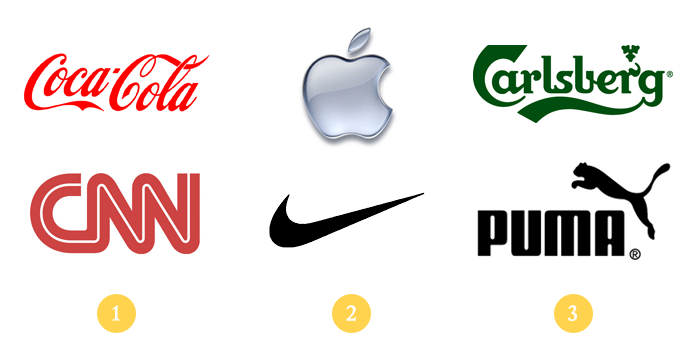
1. A wordmark or lettermark - the name or initials of your company e.g. Coca-Cola or CNN
2. An symbol or icon e.g. Apple or Nike
3. A combination of a symbol with text e.g Puma or Carlsberg

It is not essential that a logo represent the product or service of its company, but it must be memorable and easy to recognise and describe.

It is also important that logos are scalable (so that they are still recognisable at small sizes) and work in black and white (so that they can be used in situations where colour printing is not available.)

Visual Identity
Your visual identity is the visual representation of your company.

Your logo works with your corporate colours, typefaces, signage, stationery, brochures, and website etc to create your visual identity.

To create a strong visual identity it is important that each of these aspects are consistent - for example if you have corporate colours they should be used throughout your visual identity, in your signage, your website, your stationery and any other printed materials you produce.

Branding
The broadest area is branding. Your brand is your company’s personality, your values and aims. A brand is more than visuals, it is everything that a company or organisation owns, does and produces. Branding can encompass everything from customer service to events, copywriting, products and posters.

Need help with your brand, visual identity or logo? Contact us today! We’d love to help.

Design A to Z - Kerning

This week’s term is a typographic one.

Its roots stem from the days when type was manually hand set in wood and metal. Like many typography terms that we use today, the original name has stuck although the process has changed entirely.

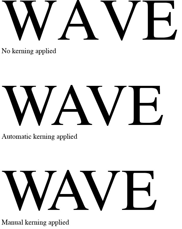
Kerning refers to the spacing between two letters or characters in a word. Designers use the method of kerning to adjust spacing between two particular characters to make the spacing even in relation to the rest of the word. Certain character combinations require kerning more often, the most common would be WA, Ya, LA, AT and the list goes on! As you can see type that is set in caps generally needs to have kerning applied to it more often.

In the examples above you can see the difference between the type before kerning is applied and afterwards – which do you prefer?

Design A to Z - JPEG

Are you puzzled by PNGs, jaded by JPEGS? Do you go googly eyed at GIF’s? Our simple guide to JPEGS and other common digital image formats is here to help!

Two of the main factors to consider while saving digital images are image quality and file size. Typically, high quality images take up a lot of computer memory, however, choosing the correct file format can help you maximise your image quality while minimising file size. File size is particularly important for images used on websites, as anyone with a slow Internet connection will tell you!

One of the reasons there are so many different types of file formats is the need for compression. Compression describes ways of reducing the size of the file. Compression can be “lossy” or “lossless”.

JPEG

Image saved as JPEG - Size:24k. Note: blurry edges on logo.

When you save a file as a JPEG you can choose how much compression to apply, the more you compress your image the smaller a file it will be, but you will lose image quality. JPEG Compression is “lossy” which means that you lose some of the file information and your image is subtly changed when you save it as a JPEG.

JPEGs are typically used to save photographs or any images with lots of tones or gradients. They are not good with sharp edges, text or line drawings; these can appear blurred unless saved with very little compression.

GIF

Image saved as GIF - Size:56k. Note: grainy texture on photo.

Unlike JPEGs the GIF format gives very good results when saving text, logos, line drawings or any image with sharp edges and limited colours. The GIF file format is limited to a total number of 256 colors or less so it does not give good result for images with gradients or a wide range of tones (e.g. photos). GIF files also support animation.

PNG

Image saved as PNG - Size:176k. Note: large file size.

The PNG file format was developed to replace GIFs and is not fully supported by very old web browsers. PNGs are non-lossy files. Unlike JPEGs photographic images can be compressed without degrading image quality. The PNG file format also supports transparency (e.g. images with a transparent backgrounds) better than the GIF file format. PNGs are usually larger in size than JPEGs and are best used for text, logos or line drawings or for images that need a transparent background.

Looking for more advice on the best file format to use? Get in touch! We’d be happy to help.

Design A to Z - Illustration

How to illustrate illustration? Well with pictures and examples I suppose!

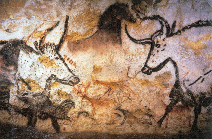
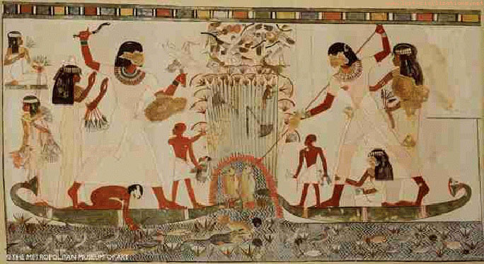
We all know the saying “A picture paints a thousand words” and it really is true. Illustration has been used for centuries as a tool for visually telling stories. As early as prehistoric cave painting and egyptian paintings, people have been using illustration as a means of depicting day to day life or special events.


Cave Paintings - http://www.donsmaps.com/cavepaintings.html


Egyptian paintings - http://www.lost-civilizations.net

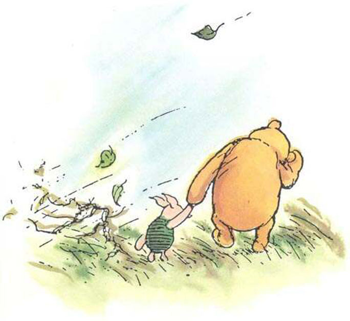
We are all introduced to illustration from a very early age, children’s books are one of the most familiar forms of illustration. If you think back to your childhood (if you can remember that far!) you will probably remember your favourites, mine were Winnie the Pooh, The Princess and the Pea and Peter Rabbit by Beatrix Potter.


Winnie the Pooh illustration - by E.H Shepard.


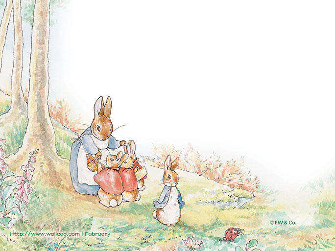
Illustration from Peter Rabbit - written and illustrated by Beatrix Potter

Can you remember your favourites?

Illustration is a very useful tool for graphic designers also. After all, it is our job to visually communicate.

There are so many different styles and methods for creating illustrations. Here at curious we can create custom illustrations as part of branding, for a website design or for a wedding invitation. If you would like to commission an illustration or discuss a particular style that you like for a project, give us a call!


Page 4 of 8« First...23456...Last »