design for events, print and web

email us on hello@curiousdesign.ie

curious logo

Design A to Z – X Y & Z

For our very last post in this series of Design A - Z and for 2011, we have decided to combine the last three letters into one post all about the alphabet. After all, where would we be without the good old alphabet.

The alphabet is one of the first things that we learn about in life, from a very early age we are exposed to all sorts of toys and books with the familiar A B and C. The saying as easy as ABC is a funny contradiction when you consider the huge and complex history that has brought us to the 26 letters that we know today. This post is more of an appreciation piece rather than a detailed history of the alphabet, if you are on the hunt for more information about the origins and development of the modern alphabet then visit this link on I love typography.

The letters that we are all so familiar with and use every hour of every day have roots that stem as far back as language itself. Written communication in it’s earliest forms appeared as pictures known as pictography or ideography. These picture representations of daily life were drawn on cave walls and tablets. The spoken word was used to interpret these pictures.

These basic pictures were modified over time and characters were added in an attempt to communicate more accurately. Thousands of characters and symbols were used to communicate. This was not the most efficient way of creating a written language, as learning to read these pictures and characters was a complex task relying on memory. One form of such written communication was hieroglyphics. Learning hieroglyphics was very time consuming and required a lot of studying. This meant that written communication was mainly confined to the wealthy and scholars.

The idea behind an alphabet is that a simple symbol represents a sound. Writing is a way of recording these sounds using these symbols – a way to record words, thus simplifying written communication. This simplification made writing and reading the written word accessible and much easier for people to learn. The development of the alphabet is one of the most important of all time, it made knowledge and communication available for all.

The English alphabet that we use to write today was developed from the Roman alphabet. The word alphabet is a combination of the names of the first two letters of the Greek alphabet, alpha and beta. These Greek words were developed from the original Semitic names for the symbols: aleph (“ox”) and beth (“house”).

The early Roman alphabet had 20 letters:

A B C D E F H I K L M N O P Q R S T V X

It then expanded by borrowing letters from the Greek alphabet, namely G, Y and Z. Below the alphabet had 23 letters.

A B C D E F G H I K L M N O P Q R S T V X Y Z

The reason that our modern English alphabet is based on the Roman alphabet is due to Roman dominance in Europe.

The English Alphabet today as we all know it has 26 letters. However we also have two versions of these 26 letters. These are divided into uppercase and the later addition of lowercase letters.

A B C D E F G H I J K L M N O P Q R S T U V W X Y Z
a b c d e f g h i j k l m n o p q r s t u v w x y z

Lowercase letters were developed from cursive hand written versions of the uppercase letters. Although uppercase and lowercase letters look very different, when we are learning the alphabet, we learn that both a and A represent the same sound. We also learn to recognise the familiar characteristics that make an “a” in one font the same sound as an “a” set in another font.

So have a good look around you and notice just how important the alphabet and written communication is to us in our day to day lives. Where would we be without our AB and C’s?

We hope that you have enjoyed our Design A - Z posts this year, we would like to wish you all a merry Christmas and a peaceful and prosperous New Year!
Design A to Z – WordPress

Here at curious we build many different types of websites, from wedding blogs and classified sites to company websites, and everything in between, but one thing that most of them have in common is the Content Management System that they are built in: WordPress.


A Content management system is software which allows you to easily add and make changes to the content on your website. (For more details see our CMS post)

We are not the only WordPress fans - WordPress is currently the most popular CMS in use on the Internet. But what makes it so popular?

WordPress is Open Source
Unlike some other CMSs, WordPress is free to use. When budgets are tight this is a big advantage!

WordPress Plugins
One of our favourite things about WordPress is the huge range of plugins available. A plugin is a small program that can add extra features to WordPress. There are plugins for everything from fancy galleries and slideshows to facebook integration. We have a library of trusted plugins that we return to again and again to add extra functionality to our websites.

WordPress is Search Engine Friendly
Google rankings are very important – a beautiful website is useless if no-one can find it. WordPress is built to be easy for search engines to find and we can customize it for you to improve your results even further.

Built-in Blogging
A blog is a fantastic way to engage with your customers or clients and keep them up to date with all of your news.

WordPress was originally developed as blogging software and it has excellent built-in blogging tools. Uploading images, saving drafts, managing comments, blocking spam, and tagging and categorising posts are all simple tasks in WordPress.

WordPress is Easy to Use and Update
The most important feature of WordPress for us is how easy our clients find it to use. Writing and updating content and adding images video or audio are all simple tasks.

Got questions about WordPress? Get in touch –we’d love to help!

Design A to Z – Vector

This week we are looking at vectors, but not the type you did in maths in school!

If you are sending logos to a designer for a poster, flyer or other piece of promotional material they will usually ask for these logos to be supplied as vector images. But what exactly is a vector image and what makes it different from other images?

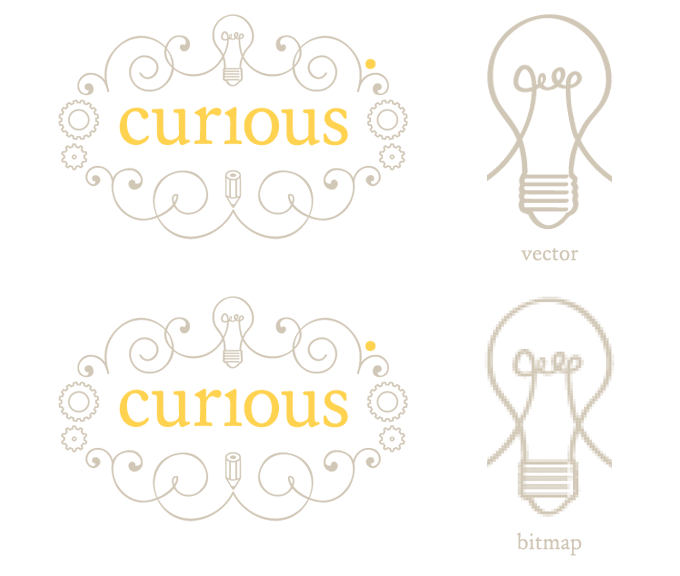
Illustrations, logos and text are usually created and saved as vector images. Unlike digital photographs and other bitmap images, which are made up of pixels, vector images or files are made up of scalable shapes. This means that they can be stretched or shrunk without losing quality.


This image shows the difference in image quality between a magnified vector and a magnified bitmap - vectors can be scaled without losing quality while bitmaps cannot.

Vector images are also not confined to a rectangular shape, they can be anything from a simple circle to a very complex swirling pattern. This makes vectors easy to layer on top of other images such as a coloured backgrounds or a photograph. It is also much easier to change the colours in a vector image than other types of image.

Vector files are often created by special software, so you may not be able to open them unless you have this software installed. You can usually tell if a file is a vector by its file extension.

.ai .eps and .svg are common vector file extensions. Vectors can also be saved as pdf files, though not all pdf files are vectors.

Have questions about vector files or other file types? Get in touch, we’d love to help.

Design A to Z – Uncoated

With the weather outside at the moment, you certainly wouldn’t want to be uncoated. If you went out without a coat you would be drenched and very very cold! Just to clarify, for today’s post we will be looking at paper rather than fashion.

The two main categories that paper and board are available in are coated and uncoated stocks. We usually use the word paper to describe lighter weights of stock and board for heavier weights. Paper and board come in lots of different weights and thicknesses from very light and thin to very heavy and thick.

When paper is being manufactured it is either left in it’s natural state or it has a fine coating applied to it. As you can guess, if it is left without any coating it is called uncoated and if a thin coating is applied to it, it becomes coated – as simple as that!

Uncoated paper is used everyday for general office printing, newspaper and book printing. Uncoated papers are better for writing on and reading from. They have a matt finish and are available with lots of different textures. Heavier weights of uncoated papers are also available for use on business cards etc. Uncoated papers are more porous than coated papers, this means that ink tends to seep into the fibres of the paper. Colours will appear differently when printed on uncoated versus coated papers. Most recycled paper is uncoated.

Coating is a process by which paper or board is treated with an agent that coats the surface. This coating gives a smooth surface that colours tend to sit on when printed. Colours can appear more vibrant when printed onto coated paper. Coated papers are available in a gloss, silk (satin) or matt finish. Most flyers, magazines, posters and food packaging are printed on coated papers.

Pick up the nearest piece of paper to you and have a good feel of it, is it smooth or does it have a slight texture? Hold it up to the light and see if it has a shine or is it matt? Which do you prefer? We use both types for different projects here at curious. Our own business cards and stationery are printed on uncoated paper and board.

If you need any advice on the best type of paper to use in a printing project let us know!

Design A to Z – Typeface

Graphic Designers tend to love typefaces, and we are no exception! If you spend time around either of us, you are likely to hear the term typeface and font crop up in conversation.

While the two words are often used interchangeably they actually have two different meanings, so in this week’s Design A to Z we’re looking at the difference between the two terms.

Typeface refers to the design and shape of a particular set of letters, numbers and symbols. Type designers create typefaces. Times New Roman is a typeface, not a font.

Originally, when printing was still done with little blocks of metal or wood, the word font was used to describe a particular style and size of a typeface. Times New Roman Bold 12 point is a font.

Font is now also used to describe the digital file on your computer which contains the typeface information.

One way to understand the difference is to compare a typeface to a song and a font to an mp3. An mp3 file contains a song, but you wouldn’t say “Bohemian Rhapsody is an mp3 by Queen” you would say “Bohemian Rhapsody is a song by Queen.”

Not sure which typeface to use for your next project? Get in touch - we’d love to help!

Design A to Z - Serif

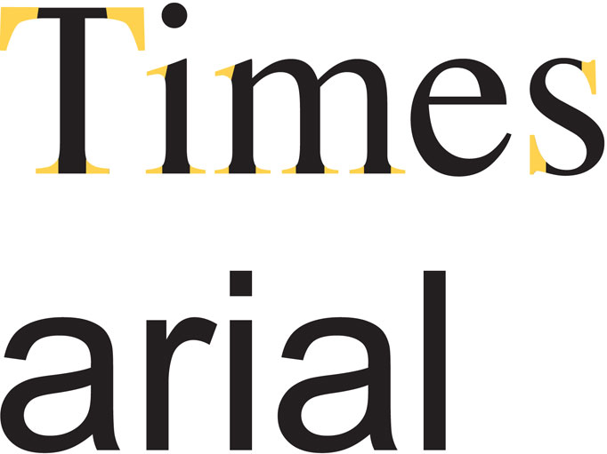
This week we are looking at the two main categories that type is broken into. Serifs and Sans Serifs. Whether these terms are familiar to you or not, I can assure you that you know at least two or three typefaces by name in both categories. If I were to say Times, and Arial to you, would either ring a bell? Can you think of any obvious differences between the two? Let me help you out…

In the example above, Times has serifs, these are highlighted in yellow. Arial on the other hand doesn’t have any serifs. A serif is a little detail or stroke at the end of a letterform or glyph. A Serif typeface has these little details and a Sans Serif typeface has no detail at the end of each letter. Sans meaning “without” in French.

Serif typefaces are traditionally used in large bodies of printed text such as in newspapers, books and magazines. This is because in general Serif typefaces are easier to read. However in an online environment it is widely believed that Sans Serifs are the best option as Serif’s can become distorted on screen.

There are countless typefaces available in each category, which are your favourites?

Design A to Z - Resolution

I know it’s only November so you are probably wondering why on earth I am bringing up the subject of resolutions before Christmas has even arrived. I’m not talking about the empty promises we make on New Year’s Day. Nope I’m talking image resolution.

In this instance, the word resolution describes the quality of an image. The higher the resolution, the better the quality of the image.

Digital images (photographs etc.) are made up of tiny coloured squares. These squares are called Pixels. Pixel is short for picture element. If you zoom right into any digital photo you will eventually see the individual square pixels that make up the photo. The more pixels there are in a photo, the better the quality and the higher the resolution.

This is a close up of a low resolution image of our logo. Notice the squares - these are pixels.

In order to describe the quality of an image, we use two abbreviations - PPI  (pixels per inch) and DPI (dots per inch). You have probably heard of DPI before, but perhaps not PPI. DPI is often used to describe PPI and vica versa. In printing, resolution is measured in DPI, this is because printers use dots of colour. For on-screen images, resolution is measured in PPI.

When an image has a high resolution, the pixels are small so more of them can be packed together creating more detail. Smaller pixels produce a smooth, high quality print. Because there are a high number of pixels the image file size is also large.

Low-resolution images have less pixels, these pixels are bigger and hold less detailed information. Low resolution images have a smaller file size.

Resolution becomes very important when dealing with print. In order to print clear and high quality images, they must be a minimum of 300 DPI. If your image resolution is less than this the quality will suffer and your image will look blurry or pixelated, like the image above.

If you need any help with sizing images for print or web, let us know!

Design A to Z - Questions

One of the reasons we called our company curious is because we think that getting to know our clients and understanding their design needs is one of the most important factors in producing good design. Because of this, the very first thing we do in any design project, before research, sketching or even quoting, is to ask questions.

Some people like to sit down and go through these questions in person, others prefer a chat over the phone, while others want a questionnaire which they can read through and email back. Regardless of the format, our questions usually fall into three broad categories -

Background Information
Style and Tone
Technical & Practical Requirements

Background Information
These questions help us to get to know you, your services/products and your industry. E.g. we will ask for links to competitors websites and for an overview of your company’s history, products and services.

Style and Tone
These questions help us to establish the style of design that you are looking for. We ask for links or examples of designs you like and (just as importantly!) dislike, as well as any company branding and logos.

Technical & Practical Requirements

This section covers the knitty gritty details of the project. For print design we ask for sizes, the number of pages and quantities required. For websites, questions include the number and names of pages, and information on any special requirements such as galleries, forms, event feeds, blogs, classified sections, social media integration etc.

Got some questions of your own? Get in touch, we’d love to help!

Design A to Z - Printing

One of the highlights of our job is getting a new job back from the printers - it’s very exciting to see your work come to life!

If you are unfamiliar with the print industry however, it can be tricky to know which type of printer and print technique to use. With this in mind, we have put together this simple guide to explain some of the more common printing techniques.

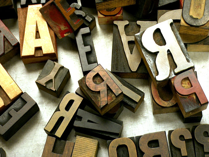
Wooden type - these letters can be used in letterpress printing

Letterpress
Letterpress is the original commercial printing technique.

Letterpress is a relief printing technique, this means that a raised surface has ink applied to it which is then pressed into a sheet of paper. The raised surface could be wood or metal type, an engraved plate or even a woodcut.

Johannes Gutenberg’s famous printing presses, which sparked the Printing Revolution in Europe in the 15th century used the letterpress technique, and letterpress remained the main printing process up until the 20th century.

While it is very labour intensive, Letterpress has enjoyed a revival recently and is often used for wedding invitations and business cards. The impression made by pressing the text and images into the paper is now often exaggerated for extra impact.

Offset Lithography
This is the most common printing process today and is sometimes referred to as Litho printing or Offset for short.

Offset lithography uses different printing plates for different colours. A black and white design would only need one plate while a colour photograph needs four - Cyan, Magenta, Yellow and Black - which combine together to create all the colours in the image. Special colours and inks can also be used. These are called spot colours and require an extra plate.

The cost of creating these plates means that this process is usually not suited to small jobs (or runs) but it is usually the most cost effective method if a large quantity of prints is required.

Digital Printing
Digital print presses are essentially very big and very fast colour laser printers.

Digital printing does not offer the same quality, flexibility and colour control as Offset printing. However, a high quality digital printer will still produce good results and as there are no plates to prepare turnaround times are shorter and set up costs lower. This makes digital printing a good choice for small print runs.

Other printing processes include screenprinting, thermography, engraving, gravure, foiling and more.

Not sure which print process is right for your job or want to use one of the processes we’ve mentioned but not sure where to start? Get in touch - we’d love to help!

Page 1 of 3123