design for events, print and web

email us on hello@curiousdesign.ie

curious logo

Design A to Z – Ellipsis…

The elusive ellipsis is a secretive little punctuation mark. It is used every day in newspapers, magazines, emails and even text messages, yet many of us don’t have any idea what one is and how it should be used correctly!

An ellipsis is a series of dots often referred to as dot, dot, dot. The name ellipsis is an ancient Greek term meaning an omission or falling short. It is an extremely useful little mark when used with restraint and within the correct context.

An ellipsis can be used to indicate an intentional omission of a word within a sentence, a pause in speech, an unfinished thought, or at the end of a sentence to show a trailing off into silence or thought.

The most commonly used form of an ellipsis is a row of three dots ( … ). Although many fonts include an ellipsis character or glyph, some typographers and designers prefer to create their own. Some prefer three dots with no spaces in between, with a space before and after the ellipsis. Others prefer a small space between each of the dots.


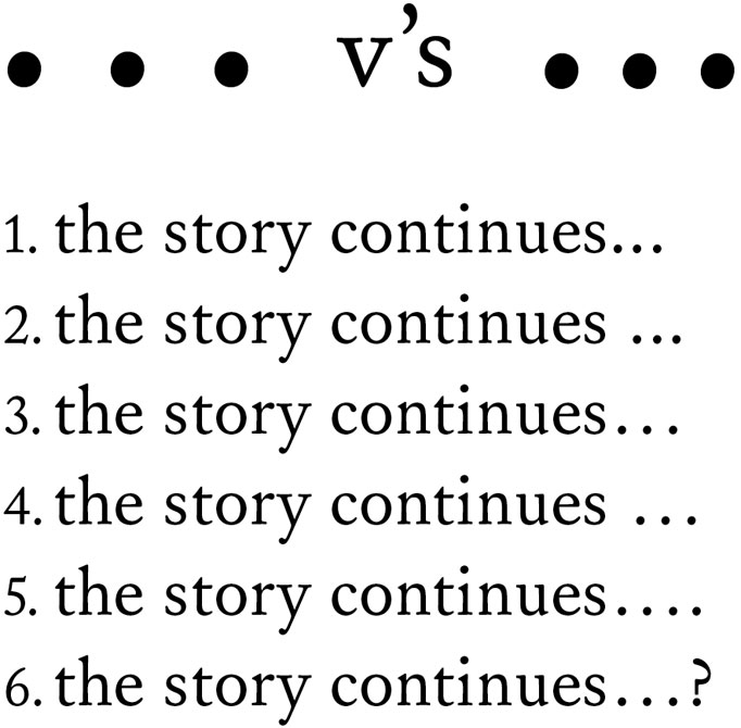
1. An ellipsis creating using three dots with no space before or between the dots.
2. Here there is a space before the ellipsis but none between the dots.
3. This ellipsis is a character with set spacing, see below for how to create an ellipsis this way.
4. Again here there is a space before the ellipsis character.
5. In this example the ellipsis sits at the end of a sentence and therefore has a full stop at the end.
6. Similar to the example above, the ellipsis finishes the sentence and is accompanied by a question mark.

When an ellipsis sits at the end of a sentence, a full stop is added on as a fourth dot and the space in front of the ellipsis should be removed. The same applies if a sentence is finished with an ellipsis and a question mark or exclamation mark. Although many people use more than three dots to indicate a pause, this is incorrect. An ellipsis should only ever consist of three marks, unless the ellipsis is at the end of a sentence.

To create an ellipsis character or glyph, hold the alt key and a semicolon on a Mac or alt 0133 on a PC. Why not try the different methods for creating an ellipsis and see which you prefer?

Design A to Z – Die cut

This is the second post in our series that sounds far more gruesome than it is! Die cutting may sound like a cruel form of torture, but it is in fact a print finishing technique.

Die cutting is a process used to cut shapes from paper, cardboard, plastic and many other materials. From business cards to food packaging and labels, most printed items that we come in contact with every day have some form of die cutting. The next time you are running around the supermarket have a look at all the different shapes that can be created by die cutting.


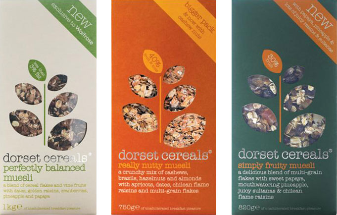
Die cutting used very effectively on Dorset Cereals packaging.

To create a die cut, a cutting forme has to be made first. These formes are made from sharp metal blades which are bent into the required shape and mounted to a strong backing, which is usually wood. The material being cut is placed on a flat surface, and the die cutting forme is pressed onto the material to cut it.


The first image shows a die cutting forme for a box, the second shows the shape created by a die cutting forme.

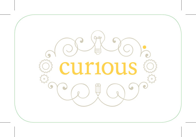
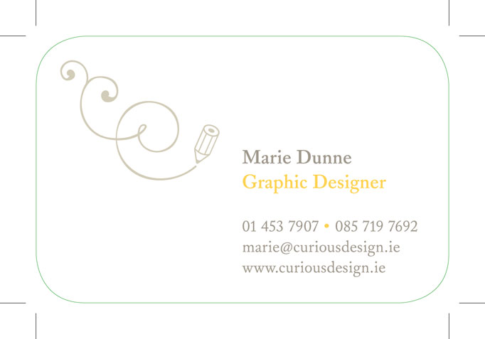
To show where a design needs to be die cut, designers use specific colours on their files to show exactly where to cut. These coloured outlines are called keylines or die lines. We used die cutting for our curious business cards to create smooth rounded corners. The images below show the keylines for our business cards. We colour our keylines green.


If you would like more information on die cutting or other print finishing processes get in touch - we’d be happy to advise you!

Design A to Z – CMS

This week’s design term is an acronym you’ll often hear on the lips of web designers and developers: CMS.

If you are are getting a website developed you’ll most likely be asked if you want one. But what does CMS mean?

The letters CMS stand for Content Management System. When used in relation to websites, a Content Management System is software which allows you to easily add and make changes to the content on your website.

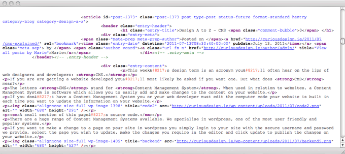
If you don’t have a Content Management System you or your web developer must edit the computer code your website is built in each time you want to update the information on your website.


A small section of this page’s source code.

There are a huge range of Content Management Systems available. We specialise in WordPress, one of the most user friendly and popular systems.

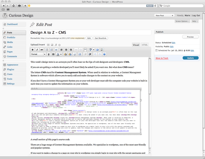
If you want to make a change to a page on your site in WordPress you simply login to your site with the secure username and password we provide, select the page you wish to update, make the changes you require in the editor and click update to publish the changes on your website.


Screenshot of the WordPress editor for this post

Once you have your login details updates can be made with any normal web browser from anywhere in the world - even with your smartphone.

As well as making text changes, you can also create new pages, edit menus, write and schedule blog posts (so you can write 7 posts today and sit back as they are published over the following week!) upload images, add videos, slideshows, and much more, all without writing a line of code!

CMS - Content Made Simple!

If you have any WordPress questions let us know in the comments or get in touch - we’d be happy to help!

Design A to Z – Bleed

The second term that we have decided to look at is bleed.

Before you rush to the first aid cabinet and root out the plasters, bleed is not something that happens after a paper cut! Funnily enough though it happens before paper is cut down to size. Bleed is a term used when referring to print jobs, you may have heard a designer or printer requesting that a document has enough bleed.

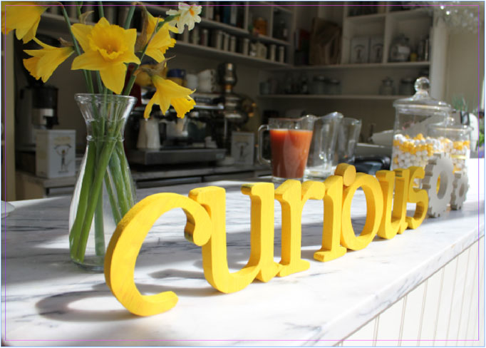
When an image, colour or element touches the edge of a page, it must extend a little beyond this edge, usually by about 3mm. This extra sliver of colour or image is said to “bleed” off the edge of the page.

The image above shows a document with bleed. The pink line is the edge of the page and as you can see the photograph bleeds over this edge.

We need to make sure that documents have this bleed area to avoid any white margins should the document be trimmed incorrectly. It is very common for documents to be trimmed a little off due to paper thickness etc. Bleed allows for these minor trimming flaws.

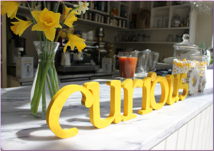
This image shows a document without bleed. The photograph stops at the edge of the page.

So there you have it, bleed in the land of design and printing is a good thing… bleeding brilliant!

Design A to Z – Ampersand

We’ve decided to write a series of weekly posts on some of the terms used everyday in the design world.

Sometimes designers can forget that the lingo we use on a daily basis in our studios may be unfamiliar to the general public. So we will take one term every week and explain it, starting from A and ending up at Z. Our first term is ampersand or the & symbol.

Most of you are more than familiar with the symbol & and probably use it quite often, but do you know how and why this little swirly mark came to represent ‘and’?

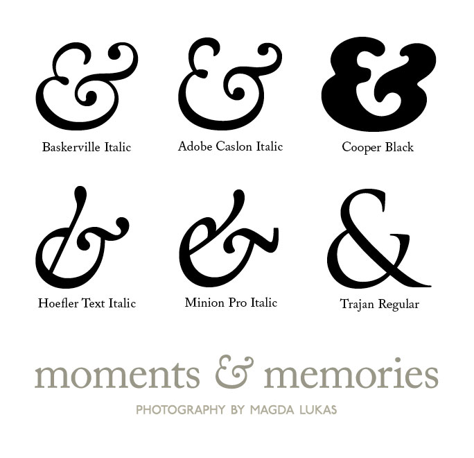
Not so long ago the ampersand was part of the Roman alphabet and sat comfortably for many years after the letter Z, but the history of the ampersand dates all the way back to the 1st century A.D. The & symbol as we know it today originates from the joining of the letters E and T, representing the Latin word ‘et’ which means ‘and’. While this original combination of the two letters is still visible in some ampersands, in most they have evolved and become so stylised that they are not recognisable as E and T. The E and T are more noticeable in the italic versions.


Ampersands are generally used in titles and company names these days rather than in body text. They also feature heavily in text messages and emails. The & symbol is included in every font. Why don’t you have a play around and try out the different ampersands that are part of your font collection! Don’t forget to try out the italic versions also - some of the most beautiful ampersands are italics. Below are a few of our favourites…

What is your favourite ampersand?

Page 3 of 3123