We’ve decided to write a series of weekly posts on some of the terms used everyday in the design world.
Sometimes designers can forget that the lingo we use on a daily basis in our studios may be unfamiliar to the general public. So we will take one term every week and explain it, starting from A and ending up at Z. Our first term is ampersand or the & symbol.
Most of you are more than familiar with the symbol & and probably use it quite often, but do you know how and why this little swirly mark came to represent ‘and’?
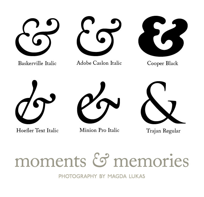
Not so long ago the ampersand was part of the Roman alphabet and sat comfortably for many years after the letter Z, but the history of the ampersand dates all the way back to the 1st century A.D. The & symbol as we know it today originates from the joining of the letters E and T, representing the Latin word ‘et’ which means ‘and’. While this original combination of the two letters is still visible in some ampersands, in most they have evolved and become so stylised that they are not recognisable as E and T. The E and T are more noticeable in the italic versions.

Ampersands are generally used in titles and company names these days rather than in body text. They also feature heavily in text messages and emails. The & symbol is included in every font. Why don’t you have a play around and try out the different ampersands that are part of your font collection! Don’t forget to try out the italic versions also - some of the most beautiful ampersands are italics. Below are a few of our favourites…

What is your favourite ampersand?
