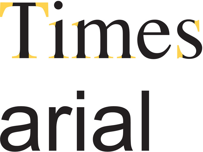
This week we are looking at the two main categories that type is broken into. Serifs and Sans Serifs. Whether these terms are familiar to you or not, I can assure you that you know at least two or three typefaces by name in both categories. If I were to say Times, and Arial to you, would either ring a bell? Can you think of any obvious differences between the two? Let me help you out…
In the example above, Times has serifs, these are highlighted in yellow. Arial on the other hand doesn’t have any serifs. A serif is a little detail or stroke at the end of a letterform or glyph. A Serif typeface has these little details and a Sans Serif typeface has no detail at the end of each letter. Sans meaning “without” in French.
Serif typefaces are traditionally used in large bodies of printed text such as in newspapers, books and magazines. This is because in general Serif typefaces are easier to read. However in an online environment it is widely believed that Sans Serifs are the best option as Serif’s can become distorted on screen.
There are countless typefaces available in each category, which are your favourites?

