design for events, print and web

email us on hello@curiousdesign.ie

curious logo

Author Archives: rachel

Design A to Z – Bleed

The second term that we have decided to look at is bleed.

Before you rush to the first aid cabinet and root out the plasters, bleed is not something that happens after a paper cut! Funnily enough though it happens before paper is cut down to size. Bleed is a term used when referring to print jobs, you may have heard a designer or printer requesting that a document has enough bleed.

When an image, colour or element touches the edge of a page, it must extend a little beyond this edge, usually by about 3mm. This extra sliver of colour or image is said to “bleed” off the edge of the page.

The image above shows a document with bleed. The pink line is the edge of the page and as you can see the photograph bleeds over this edge.

We need to make sure that documents have this bleed area to avoid any white margins should the document be trimmed incorrectly. It is very common for documents to be trimmed a little off due to paper thickness etc. Bleed allows for these minor trimming flaws.

This image shows a document without bleed. The photograph stops at the edge of the page.

So there you have it, bleed in the land of design and printing is a good thing… bleeding brilliant!

Design A to Z – Ampersand

We’ve decided to write a series of weekly posts on some of the terms used everyday in the design world.

Sometimes designers can forget that the lingo we use on a daily basis in our studios may be unfamiliar to the general public. So we will take one term every week and explain it, starting from A and ending up at Z. Our first term is ampersand or the & symbol.

Most of you are more than familiar with the symbol & and probably use it quite often, but do you know how and why this little swirly mark came to represent ‘and’?

Not so long ago the ampersand was part of the Roman alphabet and sat comfortably for many years after the letter Z, but the history of the ampersand dates all the way back to the 1st century A.D. The & symbol as we know it today originates from the joining of the letters E and T, representing the Latin word ‘et’ which means ‘and’. While this original combination of the two letters is still visible in some ampersands, in most they have evolved and become so stylised that they are not recognisable as E and T. The E and T are more noticeable in the italic versions.


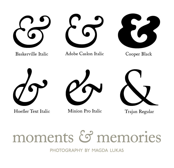
Ampersands are generally used in titles and company names these days rather than in body text. They also feature heavily in text messages and emails. The & symbol is included in every font. Why don’t you have a play around and try out the different ampersands that are part of your font collection! Don’t forget to try out the italic versions also - some of the most beautiful ampersands are italics. Below are a few of our favourites…

What is your favourite ampersand?

Father’s day treats

With Father’s day fast approaching, we thought we would inspire everyone to really treat their Dads this year. Father’s day falls on Sunday the 19th of June so you have plenty of time to plan some nice goodies and surprises.

Usually Dads don’t have as much fuss made of them as Mums do on Mother’s day. It’s much easier to think of a present for Mums - flowers, perfume, a pampering day and of course the trusty box of chocolates. Chocolates have always been associated with Mother’s day, but why not break with tradition and spoil your Dad with a yummy box of chocs this year?

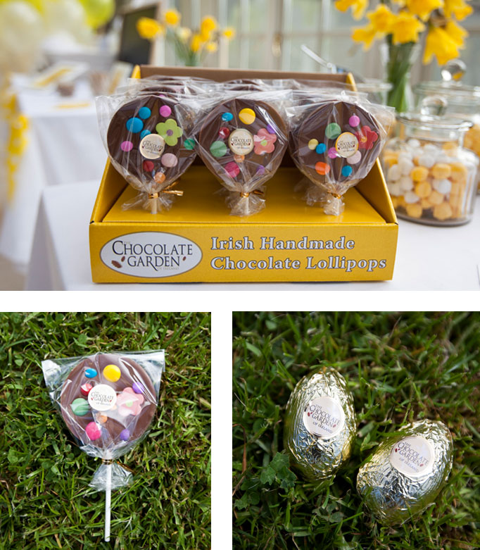
We discovered The Chocolate Garden of Ireland when we were on the hunt (excuse the pun) for some Easter eggs for the egg hunt we organised for our launch party in April. We were looking for an Irish chocolate company to sponsor the hunt, and we very luckily found The Chocolate Garden. We instantly fell in love with their deliciously moreish chocolates and were delighted that the owners Jim and Mary supplied us with some of their gorgeous eggs.

We would highly recommend having a taste of these yummy chocolates yourself, and while you’re at it, buy a big box of chocolates or a lovely lollipop for your deserving Dad!

Curious Clients: Maple Moose

I love pottering about in the garden so I’m very excited to be heading off to Bloom this weekend.

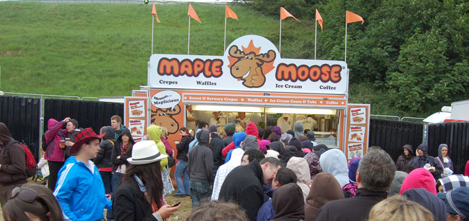
As well as all the pretty plants, I’m looking forward to treating myself to some yummy ice-cream and maybe a crepe from Maple Moose - a client of ours who’ll be serving up waffles, crepes and ice-cream all weekend in the picnic area.

They were a big hit at Slane recently - this was only a part of the queue!

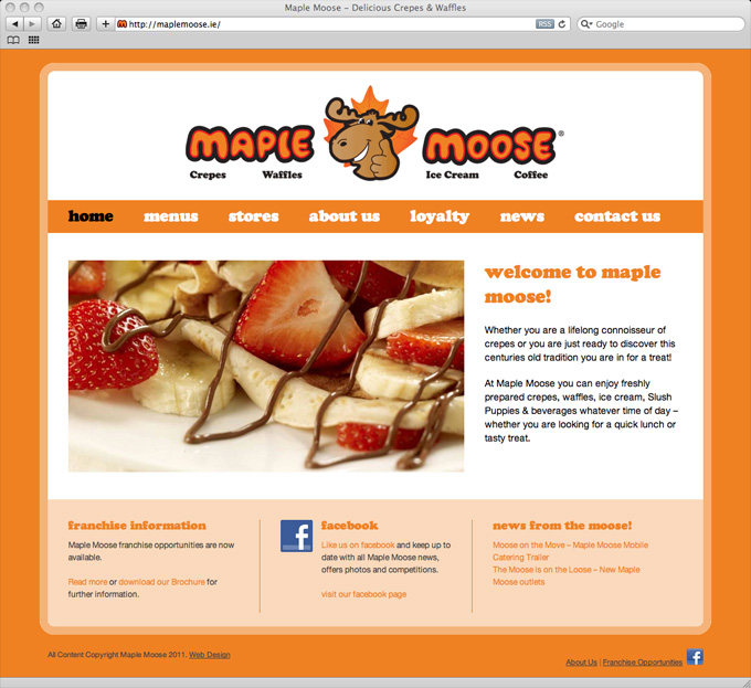
You can check out their new website which we launched yesterday for more information on Maple Moose, their menus and locations.

maple moose website design

How will you be enjoying the sunshine over the bank holiday weekend?

Curious Clients: Fight Night

There are a few days to go to the weekend but you can still squeeze in some mid-week culture with a lunchtime trip to the theatre!

Fight night by Gavin Kostick, starring Aonghus Óg McAnally is currently showing in Bewley’s Cafe Theatre until June 11, 2011.

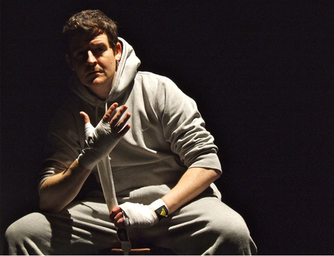
We went to see the show recently and thoroughly enjoyed the performance. We were treated to jellybeans, lucozade and an action-packed journey through the life and trials Dan Coyle Jr., a failed amateur boxer from a long line of successful fighters. Dan must come to terms with the fraught relationship he has with his father while learning to be a father to his own baby son as he prepares to re-enter the ring.

Aonghus Óg won Best Actor for his performance in Dublin’s ABSOLUT Fringe 2010 and you can certainly see why, as he delivers a moving and at times hilarious performance while skipping, boxing and jogging his way through the show.

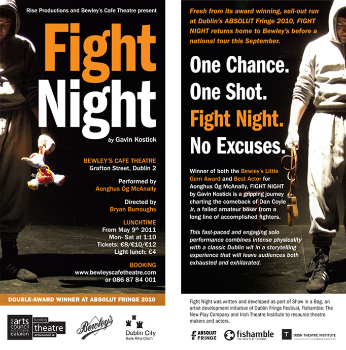
We worked with Rise Productions and the Lisa Richards Agency on the promotional material for the play. We split a photo of Dan Jr. across both sides of the flyer to show the different sides of his character - on one side a boxer, on the other a new father and a troubled son.

Fight Night runs Monday - Saturday until the 11th of June at 1.10pm, we would thoroughly recommend treating yourself to a more interesting lunch break by watching the show! For further information click here.

PS. There are still a few days left to enter our clinky competition to win one of our commemorative postcards - just comment on this post to be in with a chance to win!

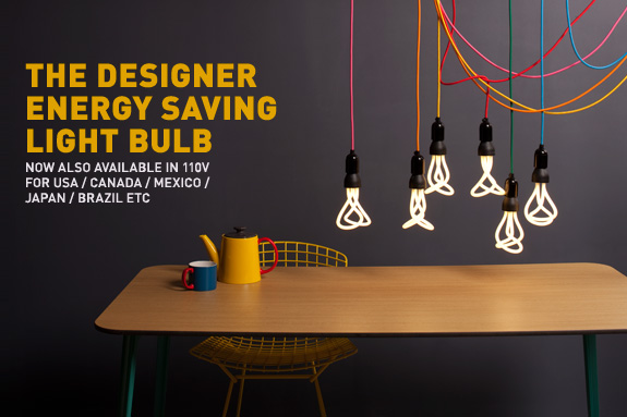
lovely light bulbs

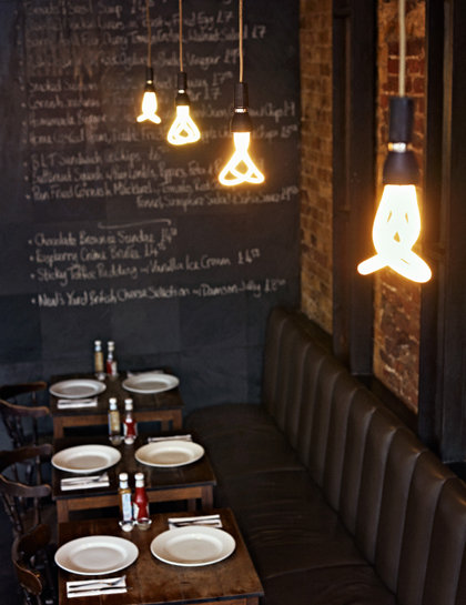
I spotted these gorgeous Plumen light bulbs in the Design Museum last week, they won the overall award for the Brit Insurance Designs of the Year 2011.

All of the things I dislike about energy saving bulbs have been addressed and solved beautifully by these clever yet simple designs. They are a little more expensive than your average energy saver, but they will last and last, and no need to cover them up with a shade, you can display them with pride!

To read more about about the concept behind the designs, or to snap one up for yourself, click here.

London called…

What a weekend! I have just returned from a quick trip over to London and Chichester. Traveling is a great way to get a fresh dose of inspiration.

I can’t count how many times I’ve been to London, but it never fails to impress. It is an amazing city full of colour, sights and sounds, plenty to get the creative juices flowing. I have ticked another few things off my London to see and do list, but it still has plenty on it to justify another few visits!

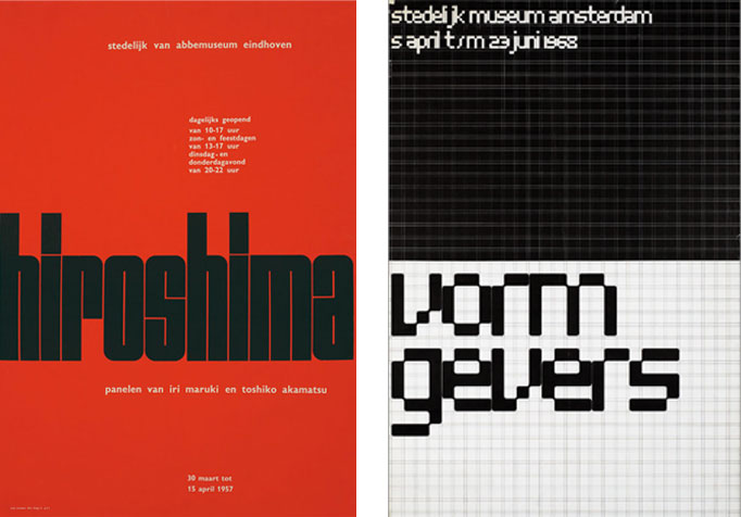
The first place we visited was the Design Museum. Currently the Museum has two main exhibitions, The Brit Insurance Designs of the year 2011 and Wim Crouwel A Graphic Odyssey. Having studied the work of Dutch Graphic designer Wim Crouwel in College, I was very excited to see some of his famous poster designs in person. Here are a couple of examples… what do you think of them?

1. Hiroshima Poster  2.Vormgevers Poster

Wim Crouwel uses very strong typography, shapes and colour in his designs, and he bases all of his designs on a grid structure.

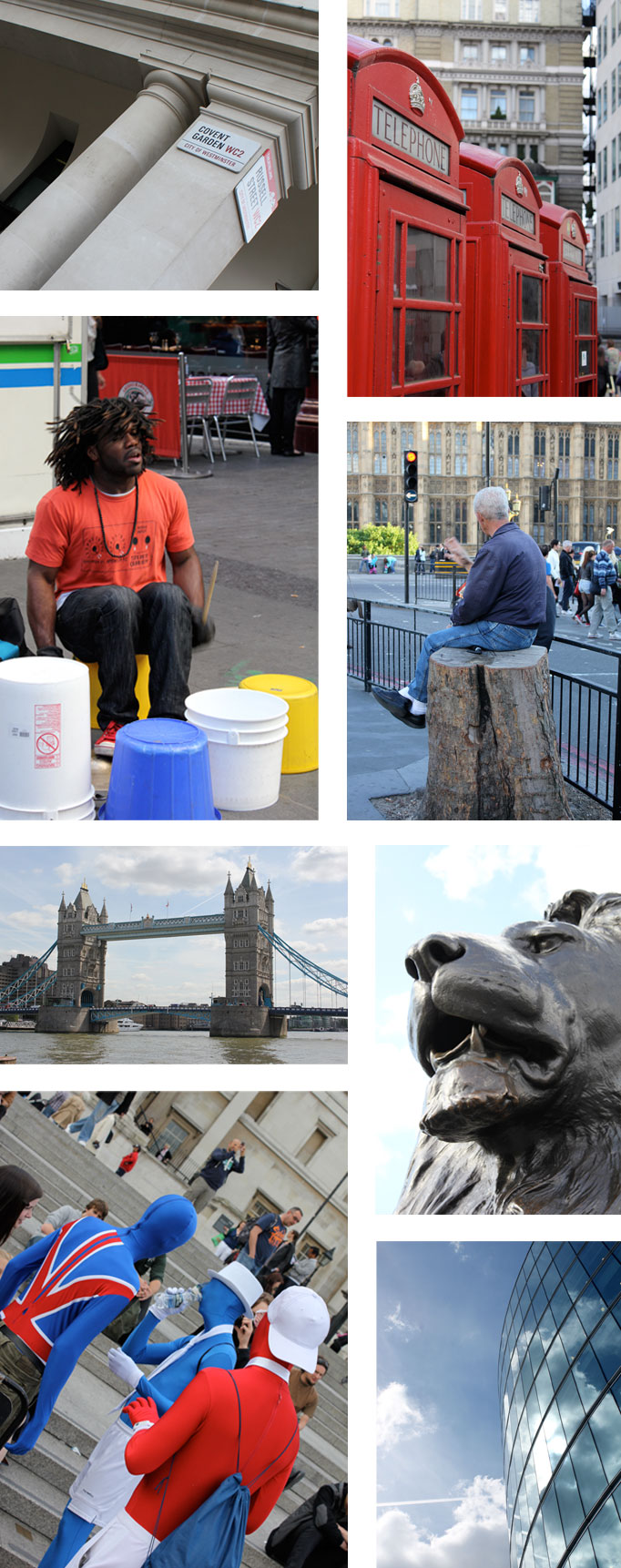
We also visited Covent Garden, the National Gallery, the London Eye, and Tower Bridge here are a few photos I took along the way.

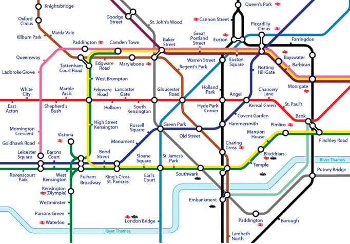
To get from place to place we used the incredibly efficient and easy to use London Underground. Every time I use the underground I am amazed by how smoothly it is run. The most impressive and iconic symbol of the London Underground is the tube map design. It was originally designed in 1931 by a man named Harry Beck and although it has seen many iterations over the years, it is still based on his original design. The design of the map is so successful because it relies on two main design elements, colour and the very legible typeface Johnston. These two when combined, create an easy to follow and legible reference for tube users, whether they are familiar with the routes or not.

Planes, trains and helicopters!

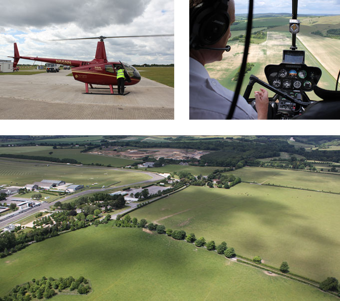
We really did use every mode of transport possible on our trip, the most exciting was our flight on a brand new helicopter! My uncle is a helicopter pilot with Elite Helicopters near Chichester and he very kindly arranged to take me up up and away for a bird’s eye view of the countryside. I was sitting in the middle of the helicopter so I didn’t take many photos, here are a few…

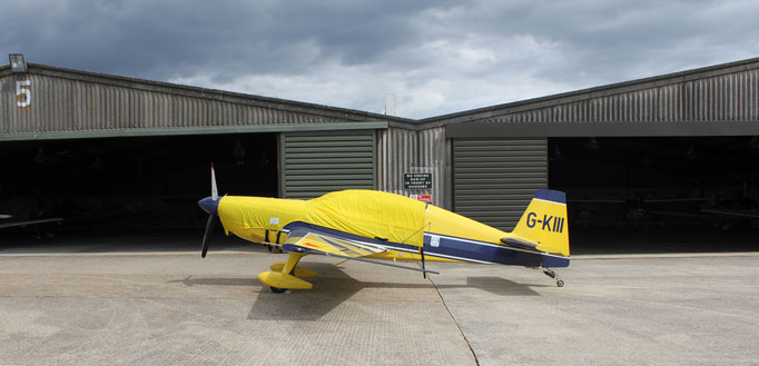
I also spotted the next business purchase I think curious should invest in, who needs a company car when you can have a company plane?!

Inspiration trips abroad could soon be a weekly occurrence!

Preparing for lift-off…

Last week we shared some photos from our launch party on Easter Saturday. Today we’re writing a little about the planning process, our inspiration and some of the elements which made the day so special.

hunting for eggs and gardens…

The first step in our planning process was a brainstorming session about the type of party we wanted. We are a friendly, creative company and we wanted a playful, pretty and informal party to reflect this. Since we are called curious we thought a treasure hunt would be a fun activity which would allow us to emphasise our name. As we were launching around Easter the initial treasure hunt idea evolved into an Easter egg hunt with afternoon tea.

With our theme in place the search for a venue began.

We needed to find somewhere that suited our style, branding and budget, with a garden area suitable for the egg hunt. This was not an easy task! After lots of research emails and phone calls we finally found the beautiful Conservatory Restaurant in Laragh, Co.Wicklow, with yummy food, a lovely garden and a light-filled conservatory perfect for the props and photos we had in mind.
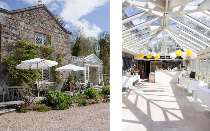
The Conservatory Restaurant, Laragh

pretty pictures

The next step is one of our favourites - researching and gathering visual inspiration.

Every design project that we undertake, be it an event, website, branding or poster, involves this research stage when we compile images and ideas from lots of different sources.

When we have gathered enough visuals, we combine them into mood boards like the one below. We then decide which ideas we would like to explore and develop.
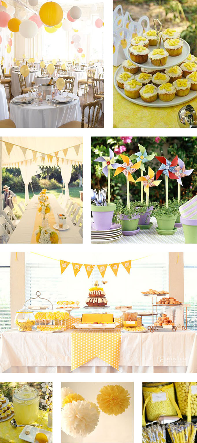

Image Credits: 1. www.marthstewartweddings.com 2. www.newenglandfineliving.com 3. www.snippetandink.com 4. www.mymagicmom.com 5. www.fortheloveofskinny.wordpress.com 6. www.newenglandfineliving.com 7. www.snippetandink.com 8. www.metmymatch.blogspot.com

make and do…

Armed with our moodboard as a reference, we set to work creating invites, props and decorations based on our branding.

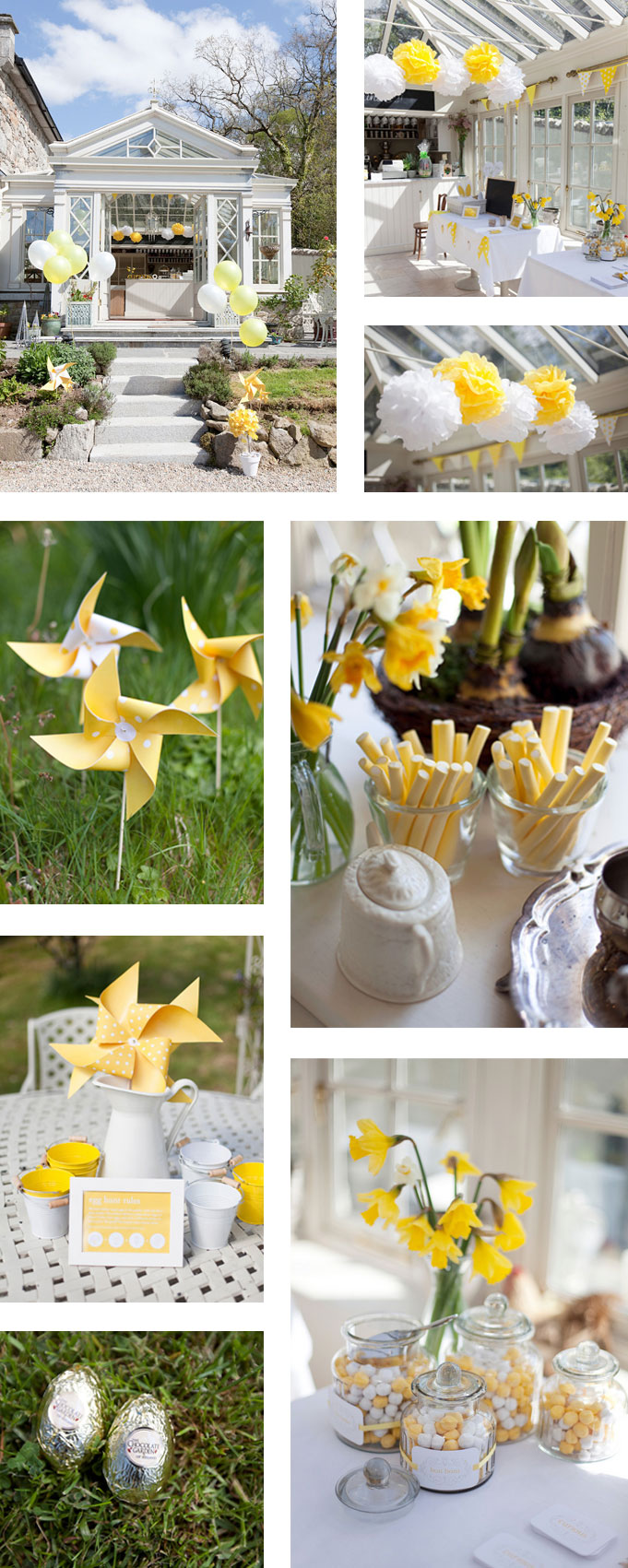
We took inspiration from our logo for the light-bulb photo props, wooden letters and cogs, egg hunt stickers and mini pencils. Our colours of yellow and white were everywhere from our pom poms, balloons, pinwheels and bunting to the bon bons we filled our guests’ goodie bags with.

special guests…

Of course the most important ingredient for any party is some lovely guests!

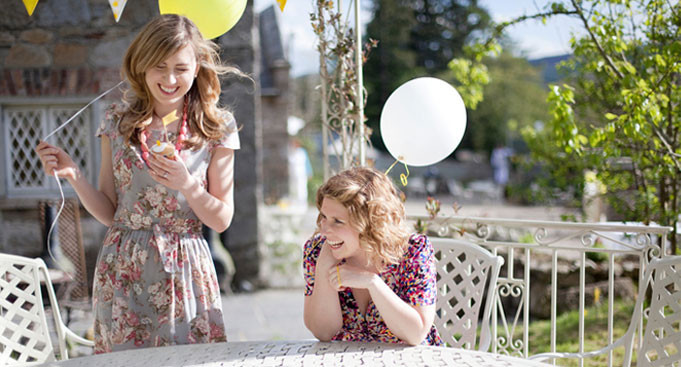
Thanks again to everyone who attended, young, old(er) and canine. We hope you all enjoyed our launch as much as we did. See if you can spot yourself below…

a curious celebration!

We had an amazing day at our launch party on Saturday, thanks to everyone who attended or sent good luck wishes!

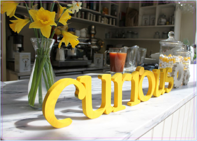
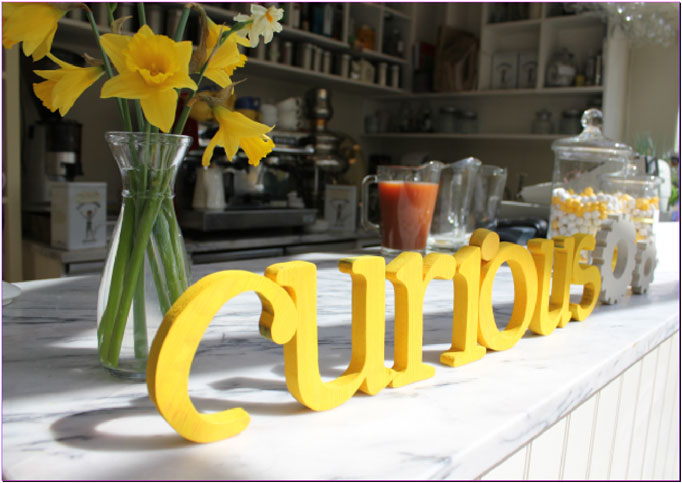
Over the next couple of weeks we will be adding posts about how we came up with the theme for our party and how we pulled it all together. First of all though, have a look at a few of the gorgeous photos our photographer Magda Lukas took of the design details…

We chose to hold our party on Easter Saturday in the stunning Conservatory Restaurant in Laragh, Co.Wicklow. Luckily the Sun Gods answered our prayers, and we had beautiful sunshine all day, providing perfect light to capture our yellow colour theme. We couldn’t have picked a better day or a more suitable venue.

We’d like to say a big thank you to all of our trusty suppliers, particularly to Lisa from The Conservatory Restaurant. We will be featuring The Conservatory in a blog post soon.

Photographer: Magda Lukas – Moments & Memories
Venue & catering: Lisa de la Haye - The Conservatory Restaurant, Laragh, Co. Wicklow 0404 45302
Chocolate eggs: The Chocolate Garden of Ireland
Flowers & Bunting: Marie Lane
Wooden letters: Jimmy Tyrrell - Jigsaw wood designs 087 9205214
Invitations and styling: curious


Page 3 of 3123