design for events, print and web

email us on hello@curiousdesign.ie

curious logo

Design A to Z - Hosting

This week’s design a-z term is hosting – website hosting that is, not dinner parties!

If you are unfamiliar with web hosting all the technical terms associated with it can be confusing so we’ve put together a simple explanation.

Web hosts don’t serve canapés but they do have computers (called servers) that are connected to the Internet.

Websites that are stored on these computers are visible online to anyone with an Internet connection.

When you pay for hosting you are renting space for the files that make up your website on one of these computers, so that your website can be seen online.

Barring technical problems, a web host operates constantly, 24 hours a day, 7 days a week so that anybody in the world can view your website at any time.

As well as hosting your website online you will also need a domain name ( the address of your website – our domain name is curiousdesign.ie) - this can be purchased through your hosting company.

We are happy to organize hosting and domain name registration for our clients. Got a question about web hosting? Contact us today!

Design A to Z – Grids

Organisation and structure, do these two words make you smile or cringe? Well like them or not, they are both very important in everyday life and also in the design world.

The best way to organise anything is to plan, and to visually map out the best way of tackling the task at hand. Whether that means structuring your working day into little segments or pockets of time, or drawing up the blueprints for a building. Most projects or tasks benefit from a little forward planning. If you fail to plan, you plan to fail*

A grid is a tool used by graphic designers to structure the information that they need to communicate. It is our job to take information (text and images) and translate it into an easy to understand yet visually interesting end product. The finished product might be a website, a book, a magazine, a poster…

Grids help us to decide where to place elements within our designs. Rather than randomly placing images or text on a page, we design a grid and use it to guide our design decisions. A grid acts like the foundations of a building and the building blocks are the information. Although we use grids to help us to decide where to position information, we are not strictly bound to the grid that we design. Grids are very flexible and provide endless layout possibilities!

To help understand how grids feature in everyday life, take a look at a newspaper. Most newspapers are designed using a strong vertical column grid. These grids consist of a margin and a number of columns with a small space between (this space is known as the gutter). This grid structure is so important to newspaper design that phrases such as “writing a column” have become everyday.
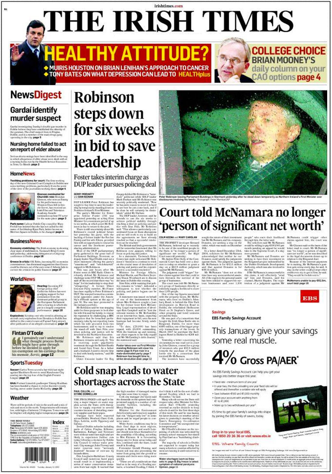

Front page from an edition of The Irish Times.

Grids not only help when we are designing for print, they are very important when creating designs for the web. The most important features of a good website are ease of navigation and clear layout. Both of these are greatly aided by the use of a well designed grid. Our very own website was designed using a grid, we design grids for all of our projects print and web alike.

Sometimes grids are very obvious, like in newspaper design and other times they are trickier to spot. Can you make out the grid that we used to design our website?

*Quote from unknown source, repeated to me by my husband :)

Design A to Z – Foiling

Today we are going to talk about foiling, often referred to as hot foiling. This is another print finishing technique that is used in many different ways by designers and printers.

The type of foil we are most familiar with in day to day life is good old kitchen tin foil which is not too dissimilar from the type that we are going look at, it is thin, shiny and comes on a roll!

To help understand what I am talking about, take out any bank note from your pocket or wallet (if you are lucky enough to have one!) and have a good look at the fancy shiny silver strip or shape on the right hand side of the front of the note. This is a type of foil that is applied to the note after it has been printed. In this instance it is used to verify that the note is genuine. This is a special type of holographic foil that is specifically designed for euro bank notes. It has textures and numbers designed into the foil to prevent counterfeiting. Concert tickets and some vouchers also use a very similar type of foil.

Foiling is also used on book covers, leather products, business stationery, packaging, greeting cards – the list is endless!


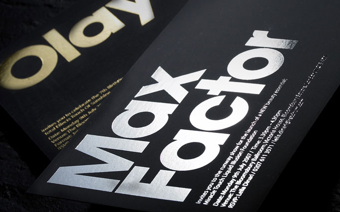
This image shows gold and silver foils on black card, image courtesy of design context

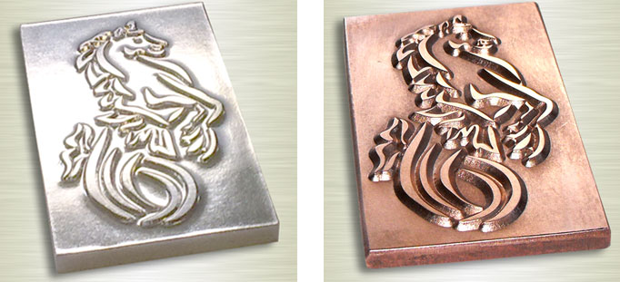
The process of hot foiling begins with the artwork that the designer intends to be foiled. This artwork is given to a die making company who etch or carve the negative of the design into a metal block or die. The dies are usually made of magnesium which is a cheap metal and can only last for a short period. Sometimes they are made of more expensive copper which lasts a lot longer and can be used again and again.


The first die shown is made of magnesium and the second is copper. Images courtesy of profoil.

The next step involves the die and the item to be foiled being positioned accurately onto a machine. Just like kitchen foil, the foil used comes on a large roll. The foil is sandwiched between the item and the die. When the heated die presses the foil against the item, it is forced onto the item and the design is created. The pressure used also leaves a slight indentation.

The range of foil colours and textures available are infinite and pantone colours can all be matched, the possibilities are endless!

If you would like to find out more about foiling or if you have a project in mind that you think would suit this technique, give us a call!

Design A to Z – Ellipsis…

The elusive ellipsis is a secretive little punctuation mark. It is used every day in newspapers, magazines, emails and even text messages, yet many of us don’t have any idea what one is and how it should be used correctly!

An ellipsis is a series of dots often referred to as dot, dot, dot. The name ellipsis is an ancient Greek term meaning an omission or falling short. It is an extremely useful little mark when used with restraint and within the correct context.

An ellipsis can be used to indicate an intentional omission of a word within a sentence, a pause in speech, an unfinished thought, or at the end of a sentence to show a trailing off into silence or thought.

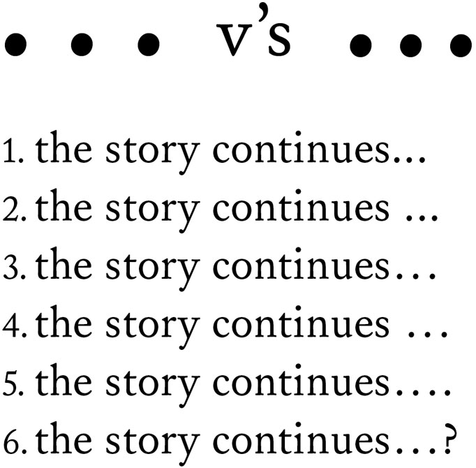
The most commonly used form of an ellipsis is a row of three dots ( … ). Although many fonts include an ellipsis character or glyph, some typographers and designers prefer to create their own. Some prefer three dots with no spaces in between, with a space before and after the ellipsis. Others prefer a small space between each of the dots.


1. An ellipsis creating using three dots with no space before or between the dots.
2. Here there is a space before the ellipsis but none between the dots.
3. This ellipsis is a character with set spacing, see below for how to create an ellipsis this way.
4. Again here there is a space before the ellipsis character.
5. In this example the ellipsis sits at the end of a sentence and therefore has a full stop at the end.
6. Similar to the example above, the ellipsis finishes the sentence and is accompanied by a question mark.

When an ellipsis sits at the end of a sentence, a full stop is added on as a fourth dot and the space in front of the ellipsis should be removed. The same applies if a sentence is finished with an ellipsis and a question mark or exclamation mark. Although many people use more than three dots to indicate a pause, this is incorrect. An ellipsis should only ever consist of three marks, unless the ellipsis is at the end of a sentence.

To create an ellipsis character or glyph, hold the alt key and a semicolon on a Mac or alt 0133 on a PC. Why not try the different methods for creating an ellipsis and see which you prefer?

A weekend treat!

We’re feeling very cheery here in curious this morning - only one more day until the weekend and according to the weather forecast tomorrow will be sunny!

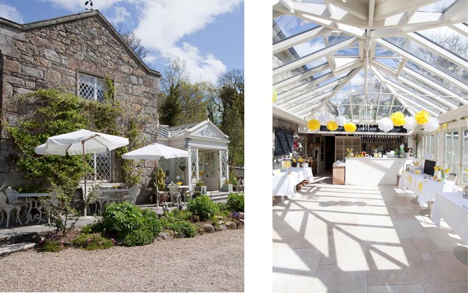
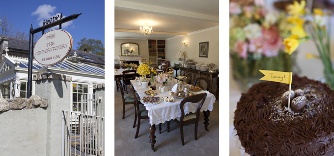
One of my favourite summer treats is enjoying some tea and cake in the sunshine, and one of my favourite spots to do this is The Conservatory, a beautiful Restaurant in Laragh, Co. Wicklow and the venue for our launch party back in April.

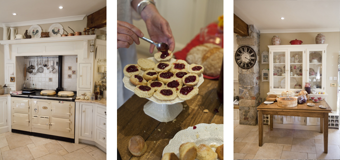
Lisa de la Haye, the owner, is a lovely lady with impeccable taste and a real talent for interior design. The conservatory which houses the cafe is beautiful, bright and airy and the garden is the perfect spot for soaking up some sun. Lisa also has a gorgeous dining room which can be booked for private events.

the conservatory laragh

You can treat yourself to yummy cakes, scones and pastries on Thursdays and Fridays or a full lunch on weekends.

And don’t worry if you overindulge - Glendalough is just around the corner so you can work off those cakes with a walk around the lakes!

Where is your favourite spot for a weekend treat?

The Conservatory is open Thursday - Sunday, 10am - 6pm.
For more information call Lisa on (353) 0404 45302 or email lisa@theconservatory.ie

All photos by Magda Lukas.

Design A to Z – Die cut

This is the second post in our series that sounds far more gruesome than it is! Die cutting may sound like a cruel form of torture, but it is in fact a print finishing technique.

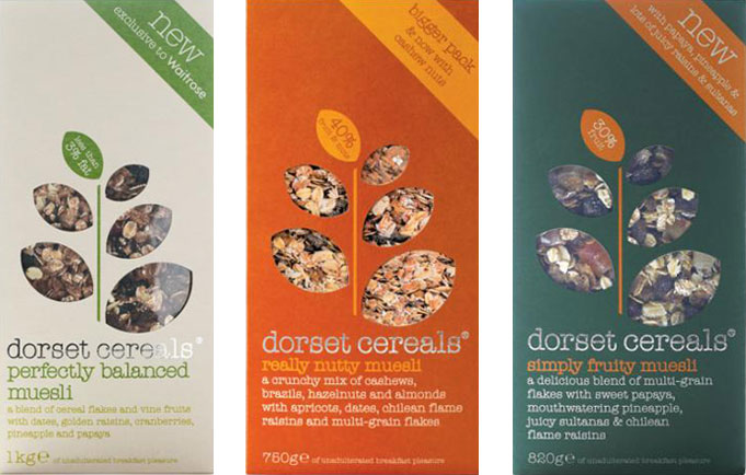
Die cutting is a process used to cut shapes from paper, cardboard, plastic and many other materials. From business cards to food packaging and labels, most printed items that we come in contact with every day have some form of die cutting. The next time you are running around the supermarket have a look at all the different shapes that can be created by die cutting.


Die cutting used very effectively on Dorset Cereals packaging.

To create a die cut, a cutting forme has to be made first. These formes are made from sharp metal blades which are bent into the required shape and mounted to a strong backing, which is usually wood. The material being cut is placed on a flat surface, and the die cutting forme is pressed onto the material to cut it.


The first image shows a die cutting forme for a box, the second shows the shape created by a die cutting forme.

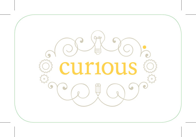
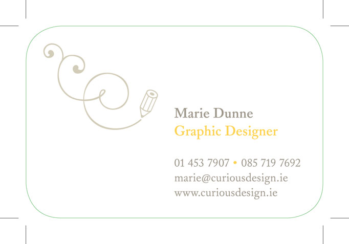
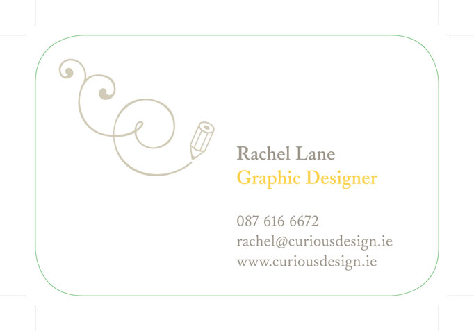
To show where a design needs to be die cut, designers use specific colours on their files to show exactly where to cut. These coloured outlines are called keylines or die lines. We used die cutting for our curious business cards to create smooth rounded corners. The images below show the keylines for our business cards. We colour our keylines green.


If you would like more information on die cutting or other print finishing processes get in touch - we’d be happy to advise you!

newsletter news

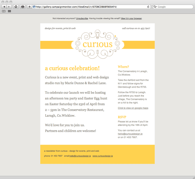
We were delighted to see our launch party email invite recently featured as an example of good email newsletter design in the Campaign Monitor gallery. Click here to see the full post.


Click here to view the live invite

Email newsletters can be an effective, inexpensive way to stay in touch with your customers and promote your business.  All of our custom email templates are easy to update and edit yourself.

Interested in an email newsletter for your business or just have a few questions? Get in touch - we’d be happy to help.

Design A to Z – CMS

This week’s design term is an acronym you’ll often hear on the lips of web designers and developers: CMS.

If you are are getting a website developed you’ll most likely be asked if you want one. But what does CMS mean?

The letters CMS stand for Content Management System. When used in relation to websites, a Content Management System is software which allows you to easily add and make changes to the content on your website.

If you don’t have a Content Management System you or your web developer must edit the computer code your website is built in each time you want to update the information on your website.


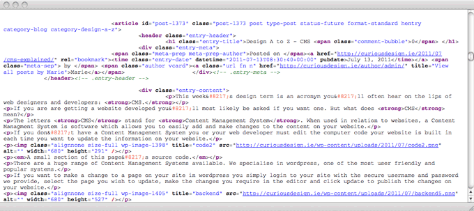
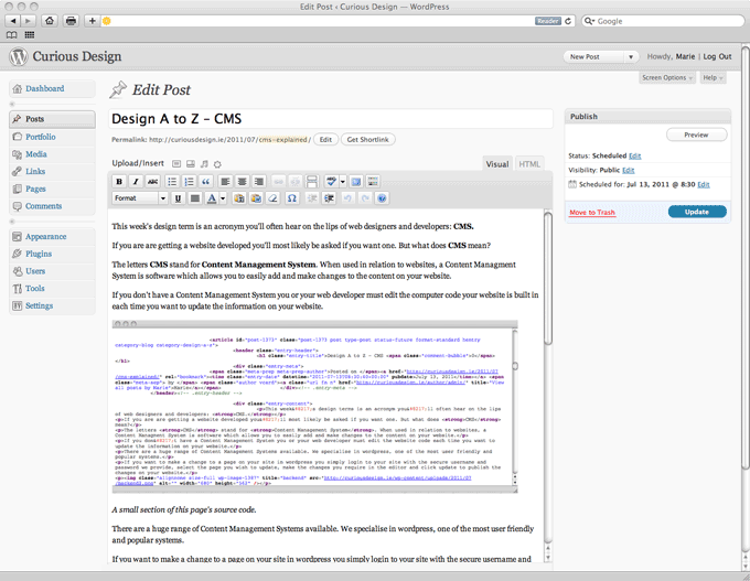
A small section of this page’s source code.

There are a huge range of Content Management Systems available. We specialise in WordPress, one of the most user friendly and popular systems.

If you want to make a change to a page on your site in WordPress you simply login to your site with the secure username and password we provide, select the page you wish to update, make the changes you require in the editor and click update to publish the changes on your website.


Screenshot of the WordPress editor for this post

Once you have your login details updates can be made with any normal web browser from anywhere in the world - even with your smartphone.

As well as making text changes, you can also create new pages, edit menus, write and schedule blog posts (so you can write 7 posts today and sit back as they are published over the following week!) upload images, add videos, slideshows, and much more, all without writing a line of code!

CMS - Content Made Simple!

If you have any WordPress questions let us know in the comments or get in touch - we’d be happy to help!

Design A to Z – Bleed

The second term that we have decided to look at is bleed.

Before you rush to the first aid cabinet and root out the plasters, bleed is not something that happens after a paper cut! Funnily enough though it happens before paper is cut down to size. Bleed is a term used when referring to print jobs, you may have heard a designer or printer requesting that a document has enough bleed.

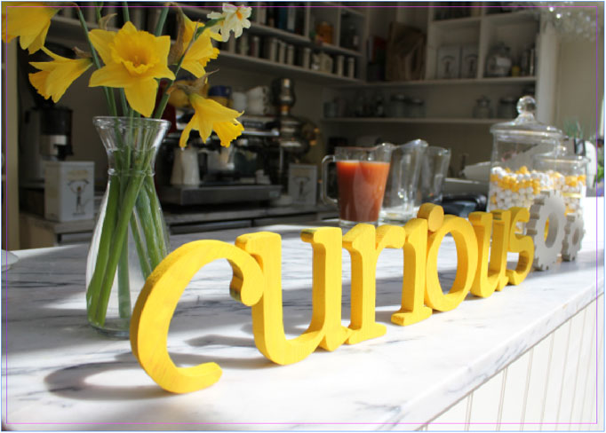
When an image, colour or element touches the edge of a page, it must extend a little beyond this edge, usually by about 3mm. This extra sliver of colour or image is said to “bleed” off the edge of the page.

The image above shows a document with bleed. The pink line is the edge of the page and as you can see the photograph bleeds over this edge.

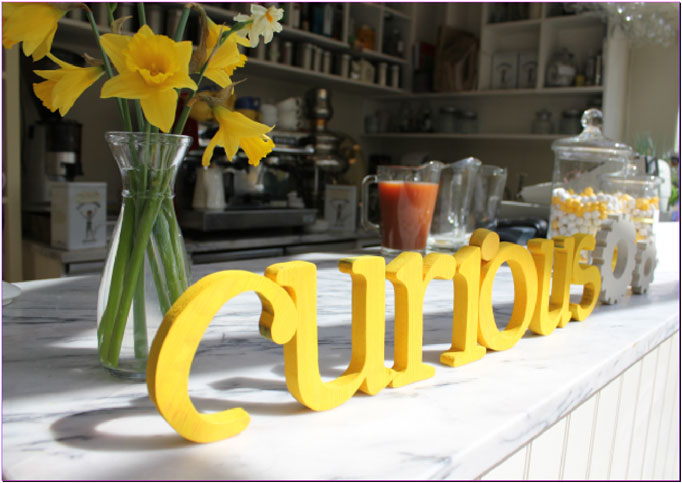
We need to make sure that documents have this bleed area to avoid any white margins should the document be trimmed incorrectly. It is very common for documents to be trimmed a little off due to paper thickness etc. Bleed allows for these minor trimming flaws.

This image shows a document without bleed. The photograph stops at the edge of the page.

So there you have it, bleed in the land of design and printing is a good thing… bleeding brilliant!

Page 5 of 8« First...34567...Last »