This is not a term restricted to the ladies out there, opacity in this instance is not related to how see-through your tights are!
It refers instead to the density of a color. The opacity of an image or graphic element can range from totally transparent or see-through (0% opacity) to fully opaque or not see-through (100% opacity). Transparency is the measure of how see-through something is or how much light can pass through an object or image.
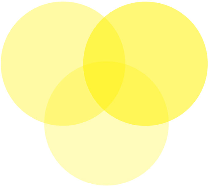
These overlapping circles are all yellow but have different levels of opacity applied to them, one is 30%, one is 40% and one is 60%. As they lose opacity they become transparent.
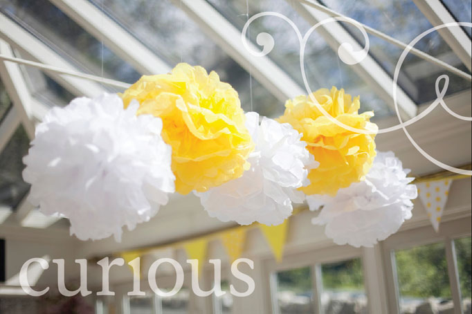
Opacity and transparency offer designers an excellent way of creating depth and texture in their design work. Designers utilise these tools in logo design, to create watermarks on stationery and many other ways, the possibilities are endless! Below is an example of a photograph with text and a graphic element placed on top of the photograph with 50% opacity applied.
Opacity was once limited to print design but recently it has moved into web design. Lots of exciting effects can be created using opacity and transparency in web design.
If you think that opacity would suit a print or web project you have in mind, let us know, we would love to explore the possibilities with you!


