This week’s term is a typographic one.
Its roots stem from the days when type was manually hand set in wood and metal. Like many typography terms that we use today, the original name has stuck although the process has changed entirely.
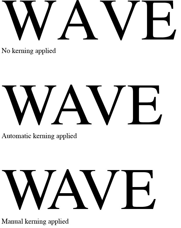
Kerning refers to the spacing between two letters or characters in a word. Designers use the method of kerning to adjust spacing between two particular characters to make the spacing even in relation to the rest of the word. Certain character combinations require kerning more often, the most common would be WA, Ya, LA, AT and the list goes on! As you can see type that is set in caps generally needs to have kerning applied to it more often.
In the examples above you can see the difference between the type before kerning is applied and afterwards – which do you prefer?

